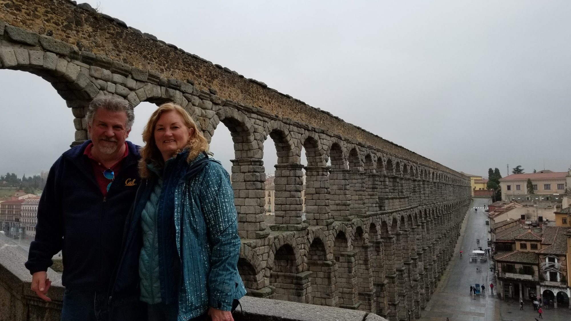
For two days we immersed ourself in the world of Antoni Gaudi, and will likely see a little more of his work before the week is finished. If you have been to Barcelona, you already know him, as he is their most famous citizen. Gaudi was a Catalan architect who fully embraced the Modernist style. His buildings are all one-of-a-kind masterpieces, and he has a very distinct style that is easily recognizable. His passions in life were architecture, nature, and religion, and he displayed these passions in all of his works.
I first heard of Gaudi in 1987, when the album “Gaudi” was released by the Alan Parsons Project. I’m a huge AP fan, so when this album came out I purchased it immediately just like all the rest. Ever since then I have wanted to visit La Sagrada Familia, the subject of the first song on the album.
Our first Gaudi stop was Casa Batllo, a house that he completely renovated in 1904, and is today a museum. This particular museum is very popular, so either go early, or pay extra for the “skip the line” tickets.

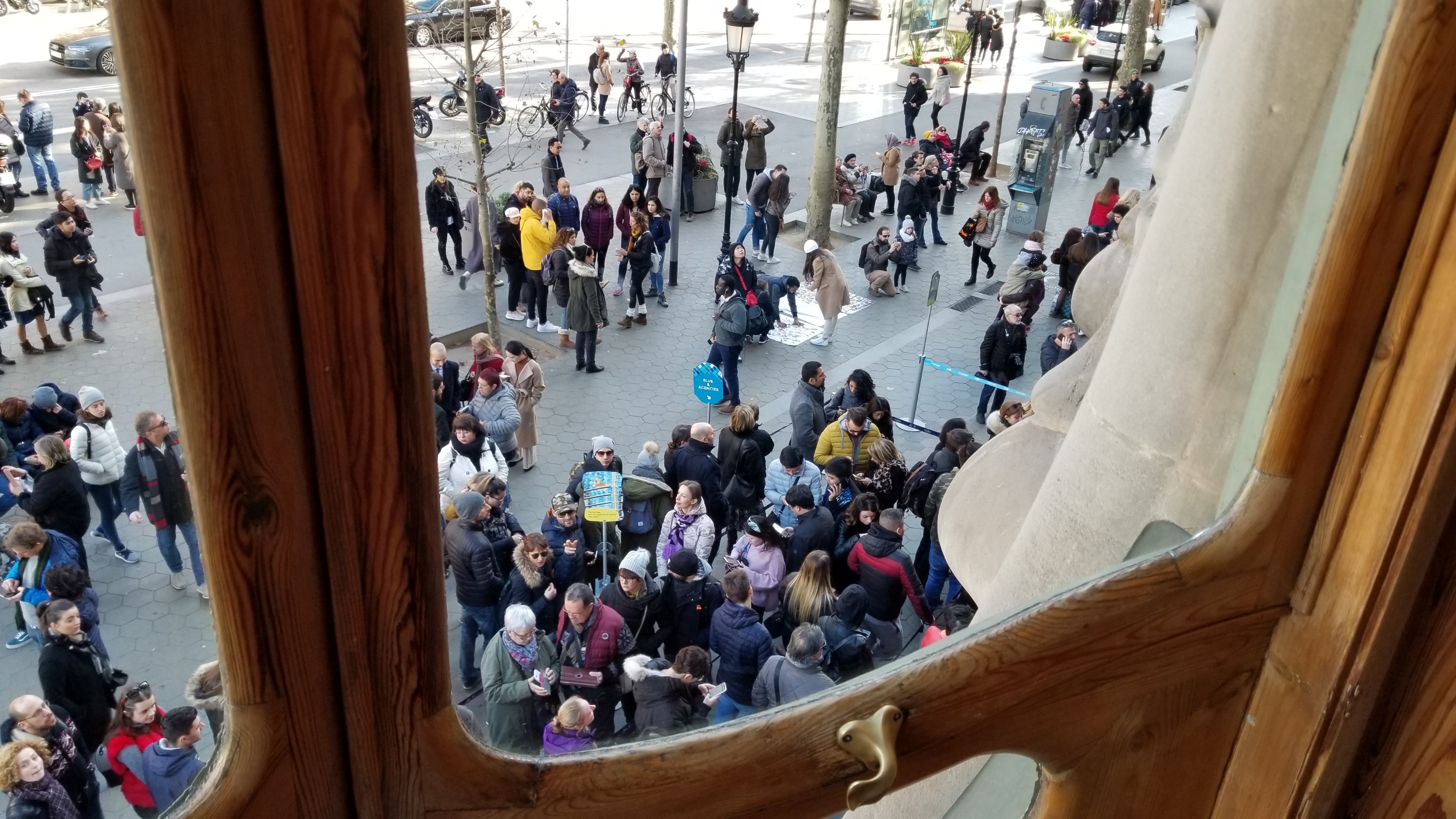
This is a view of the crowded line outside from the first floor windows you can see in the above photo.
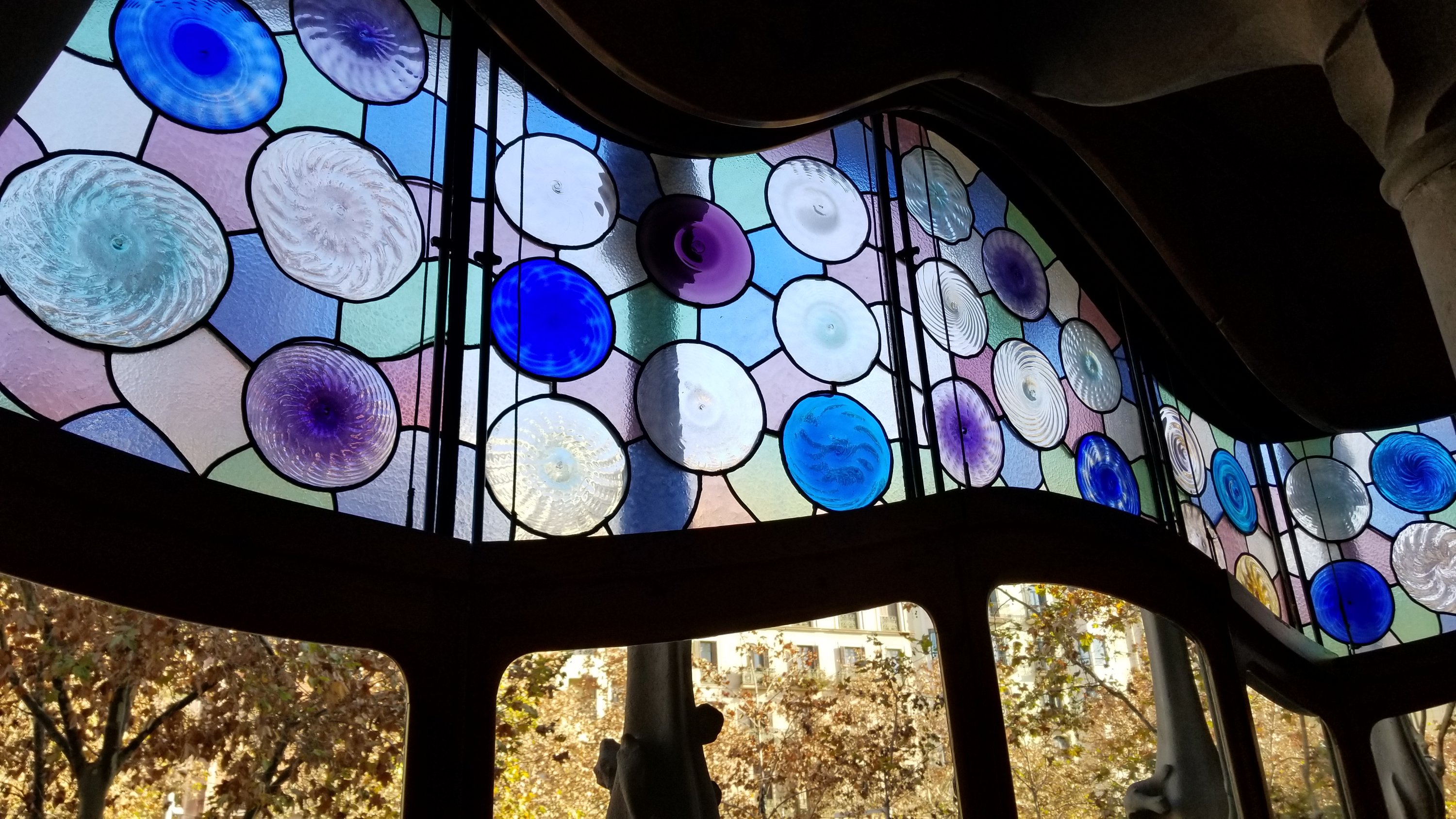
Gaudi is all about curved walls, lots of natural light, and colorful glass.
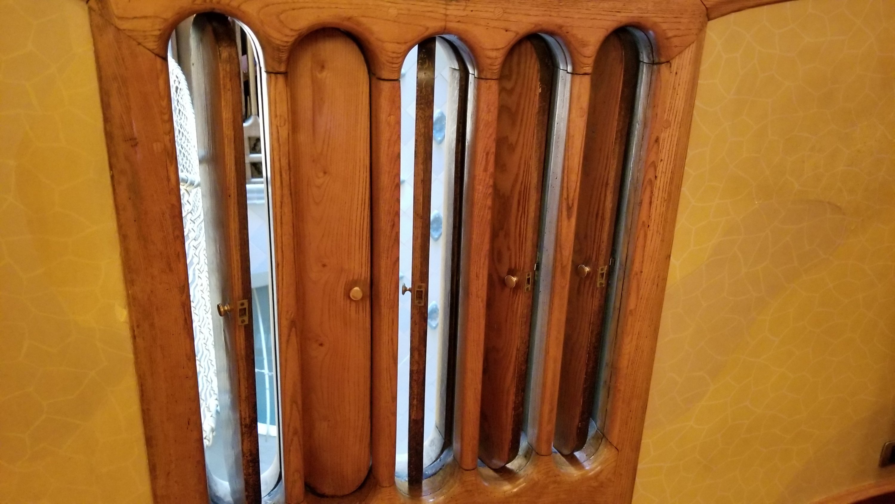
He devised a lighting and ventilation system that runs from the ground floor to the roof, and on the sides of this system, within the house, are these vents that he apparently copied from the appearance of fish gills. You can open and close the wooden vents to meter the exchange of air.
Here is the inside of the lighting and ventilation system.
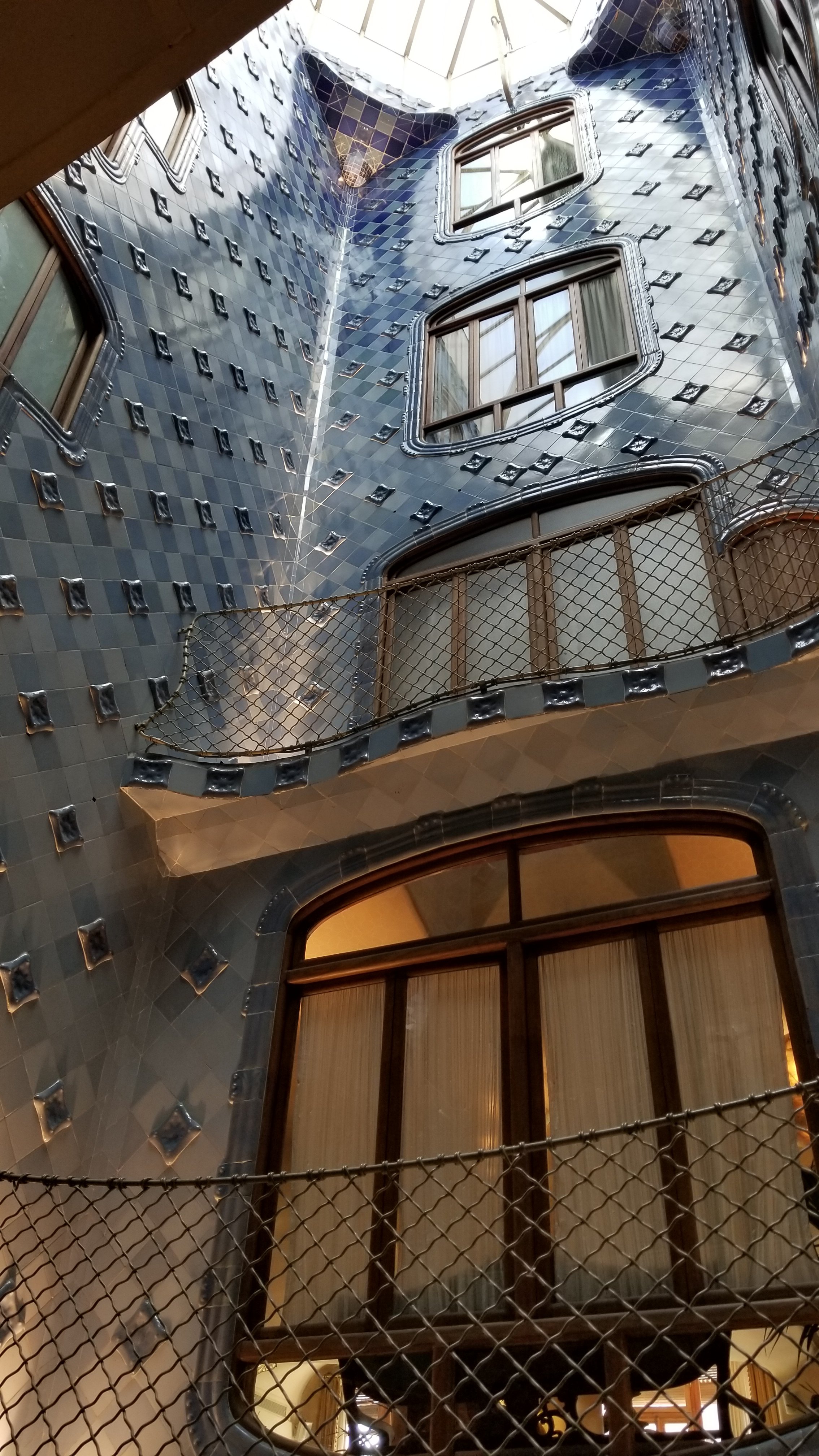
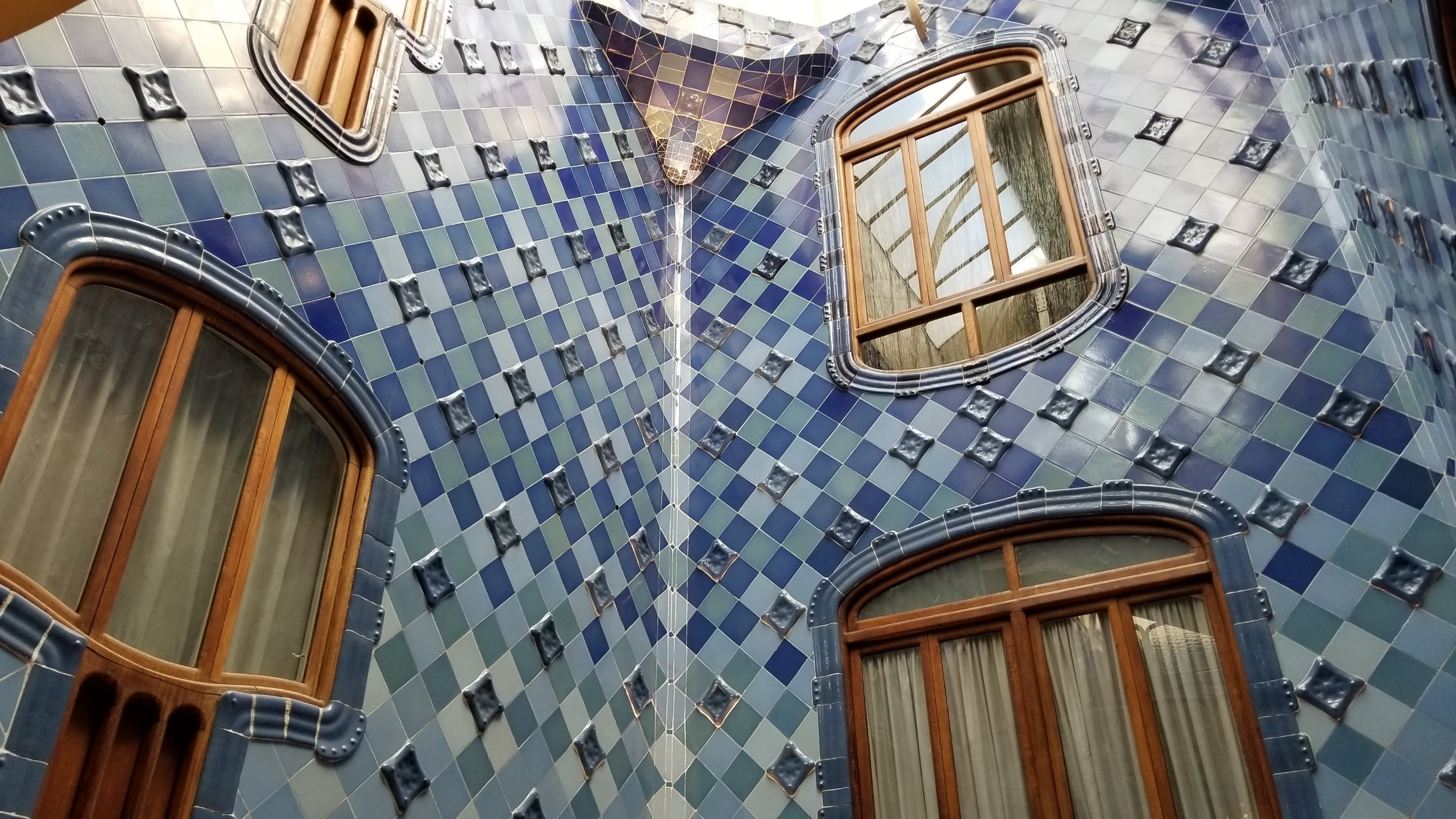
There were two of these shafts within the house so that every room could get natural light and ventilation. On the lower levels he used lighter colored tiles to allow for more light reflection. In the upper levels he used darker blues to keep the sunlight from being too bright.
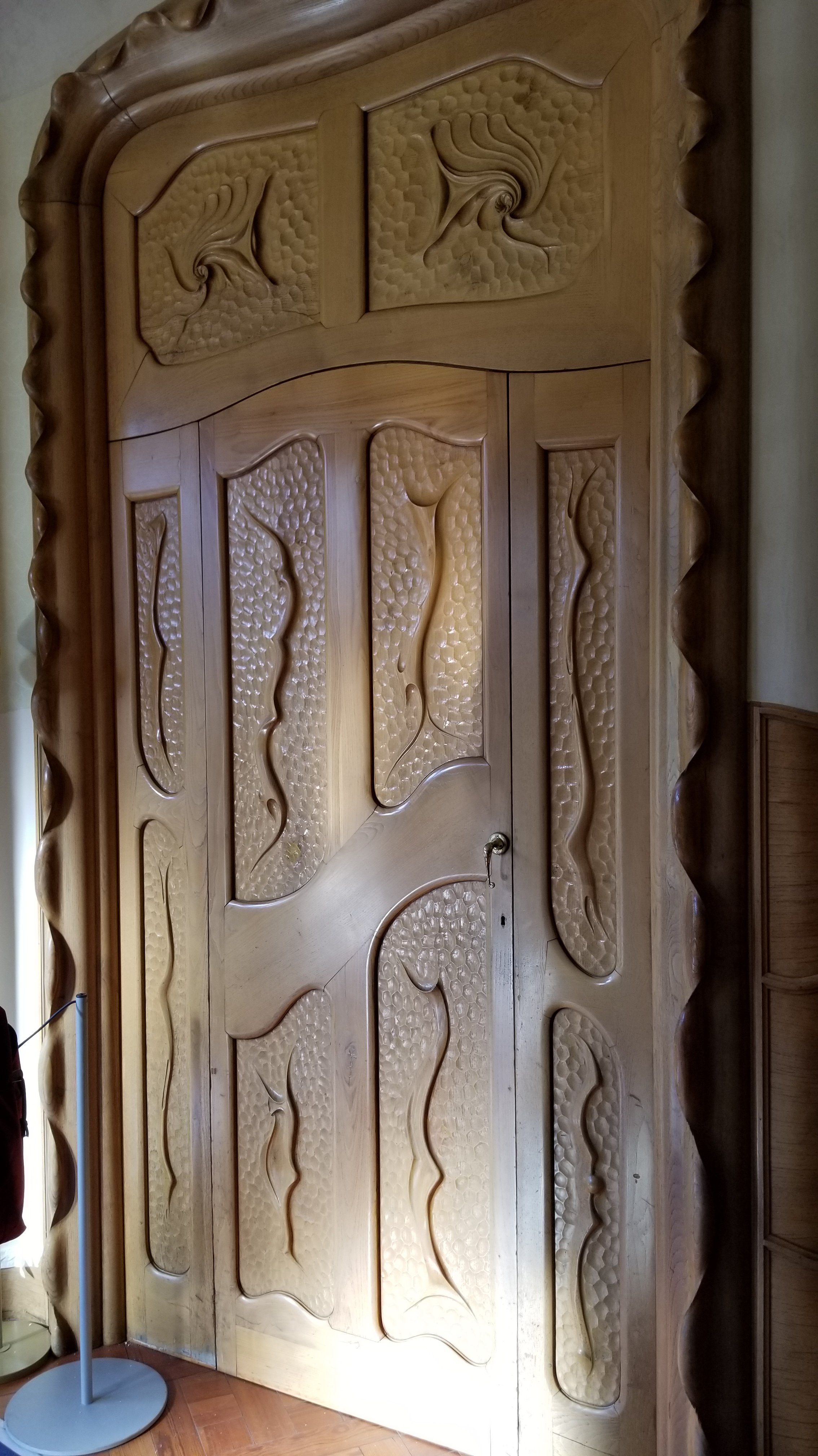
I can’t imagine how much a door like this would cost to have made today. These types of designs were on all of the doors. Gaudi even designed the door handles himself.
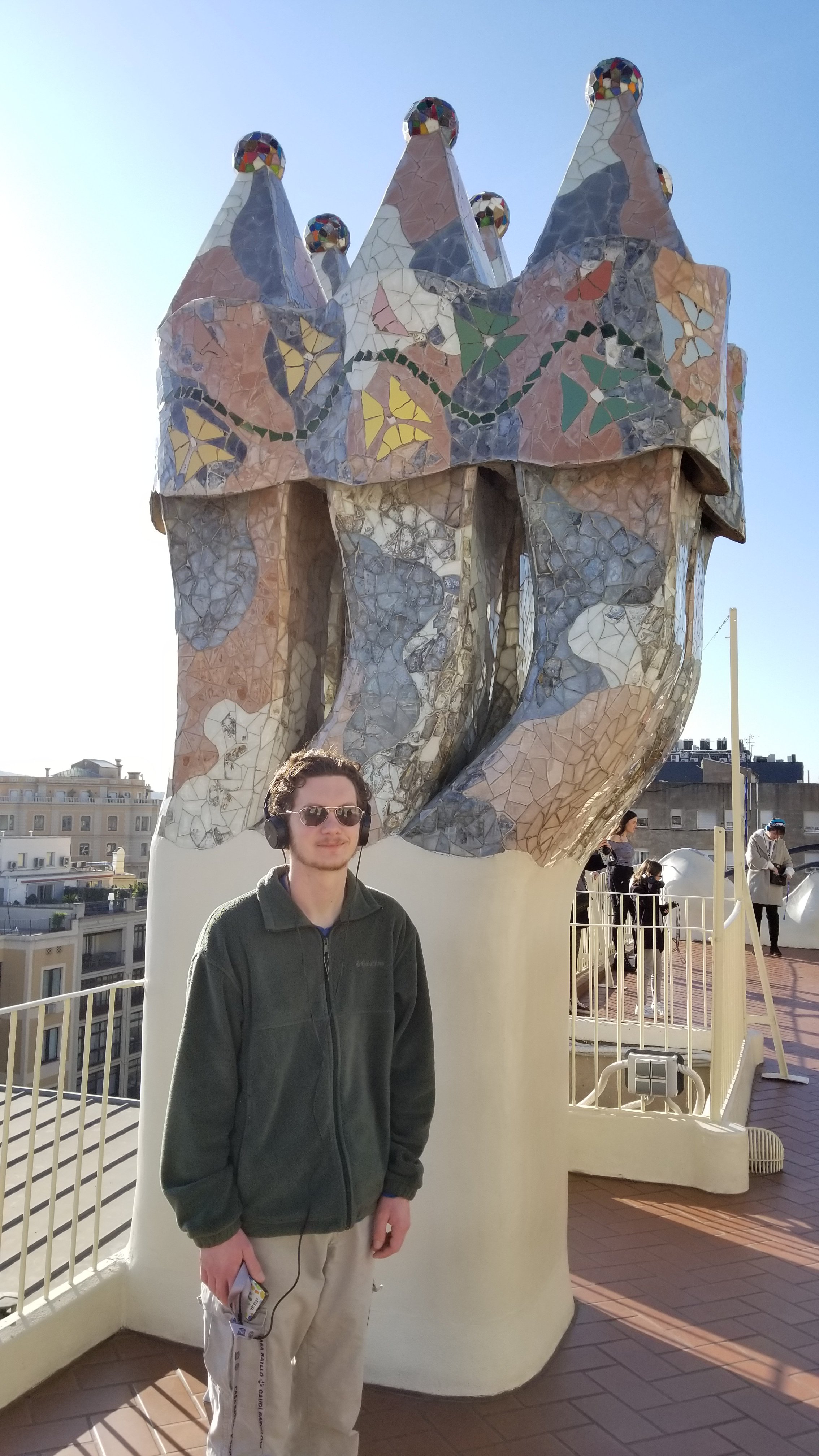
The rooftop is an amazing variety of Gaudi goodness. Fletcher is standing next to some of the chimney’s for part of the house.
Another set of chimney’s. Thinking maybe I need to do this to our chimney back home!
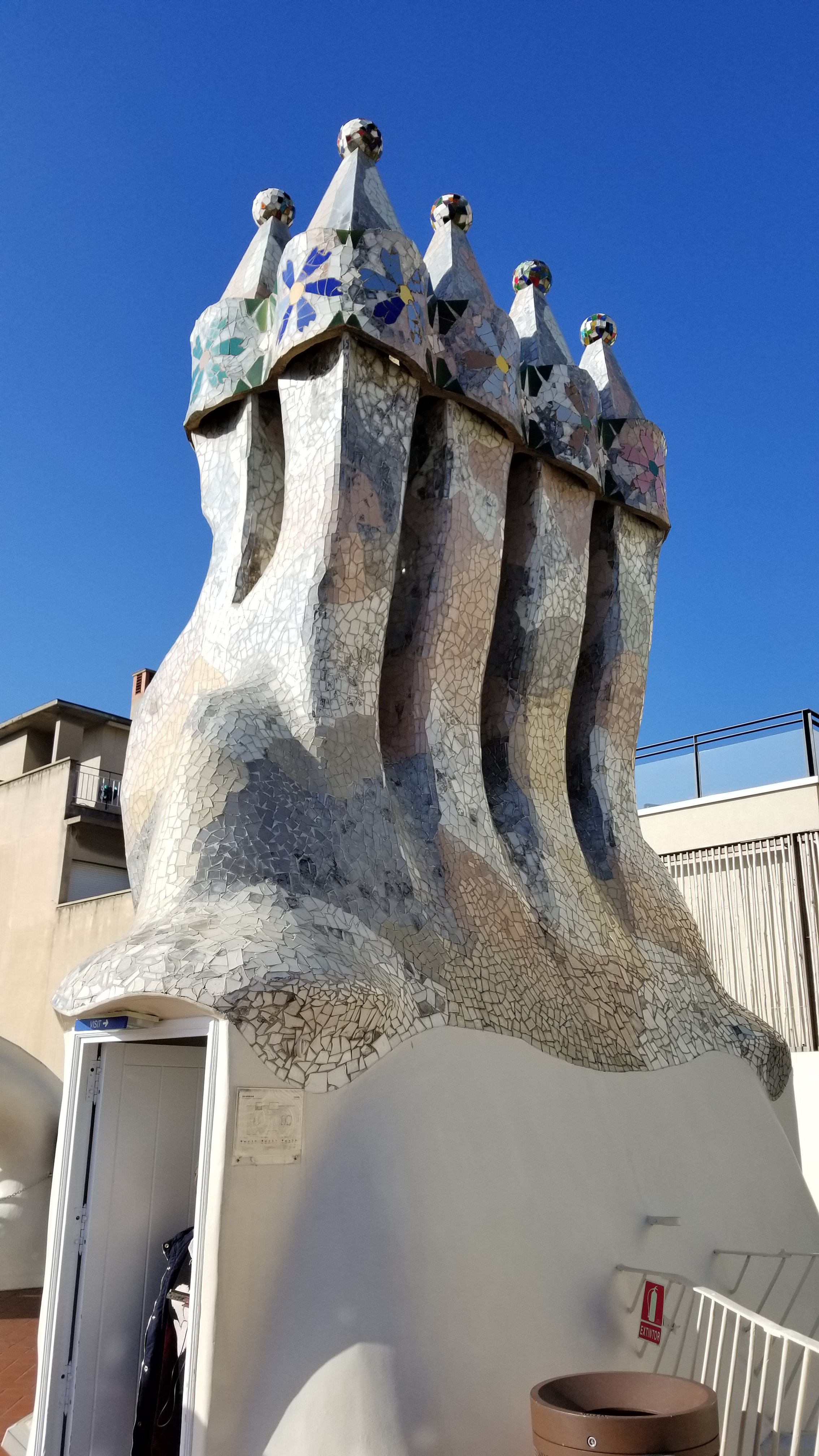
This is supposed to be the back of a dragon.
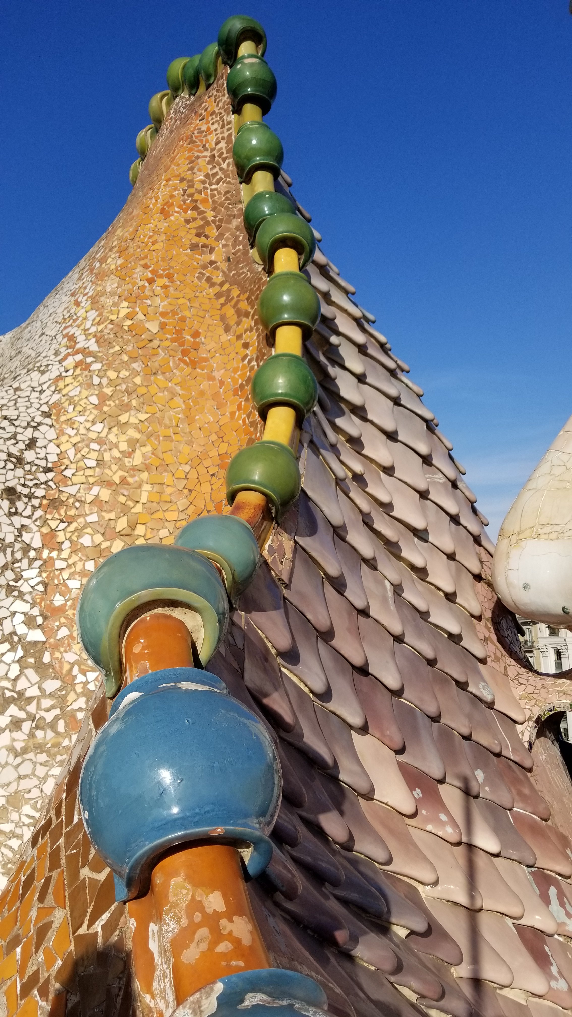
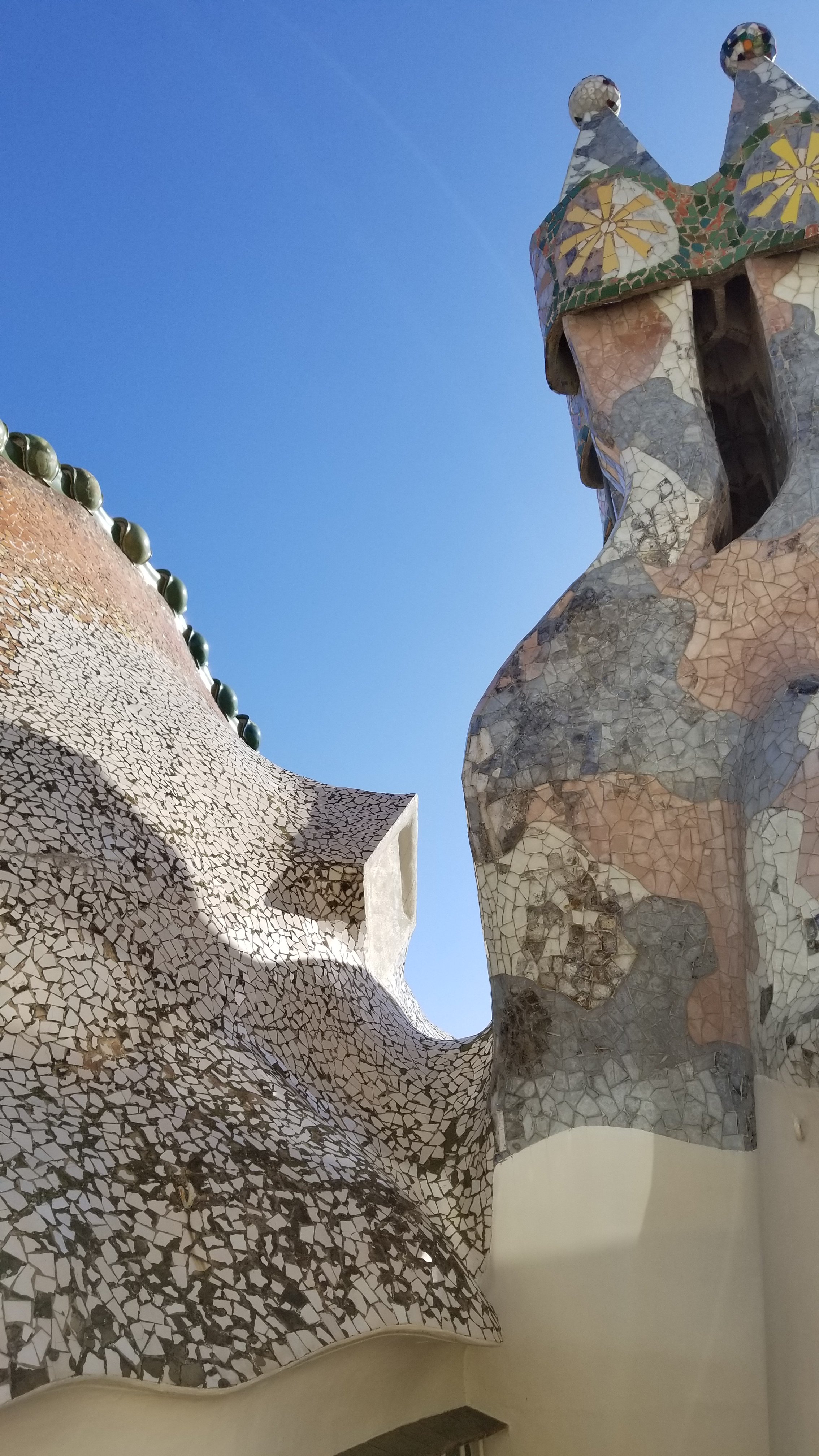
More chimneys next to the dragon. This place has a lot of chimneys! Since Gaudi liked to do a lot of curved lines, he ended up using a lot of fragments of cermic tiles, using what would otherwise most likely have been thrown away. He was a strong believer in using as much of the building material waste as possible.
They have a spot where they take a photo of you on a balcony along the facade (the camera is on a long selfie stick) so that they can have you part with 20 euros or so. Anything for a buck! Nope…skipped it. That’s for the people that wait in line after paying to get into the Harry Potter bookstore.
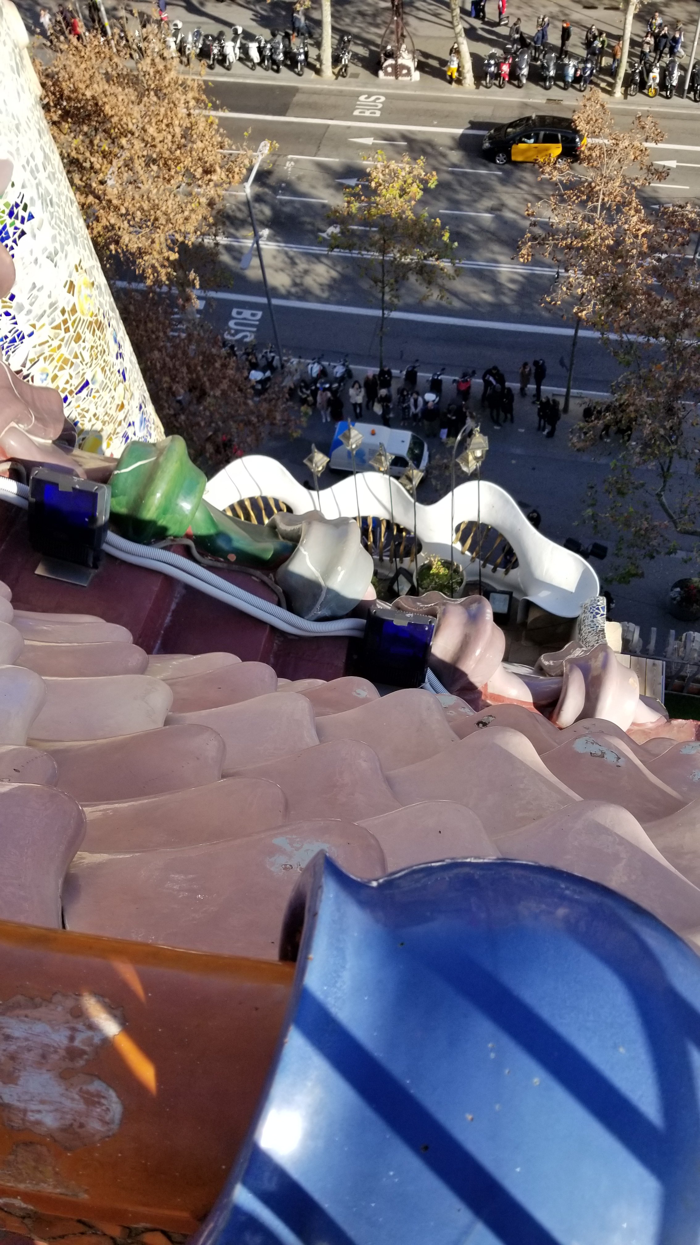
Here is a view down the facade from the roof. The balcony in white was made using mostly scrap metal from the project.
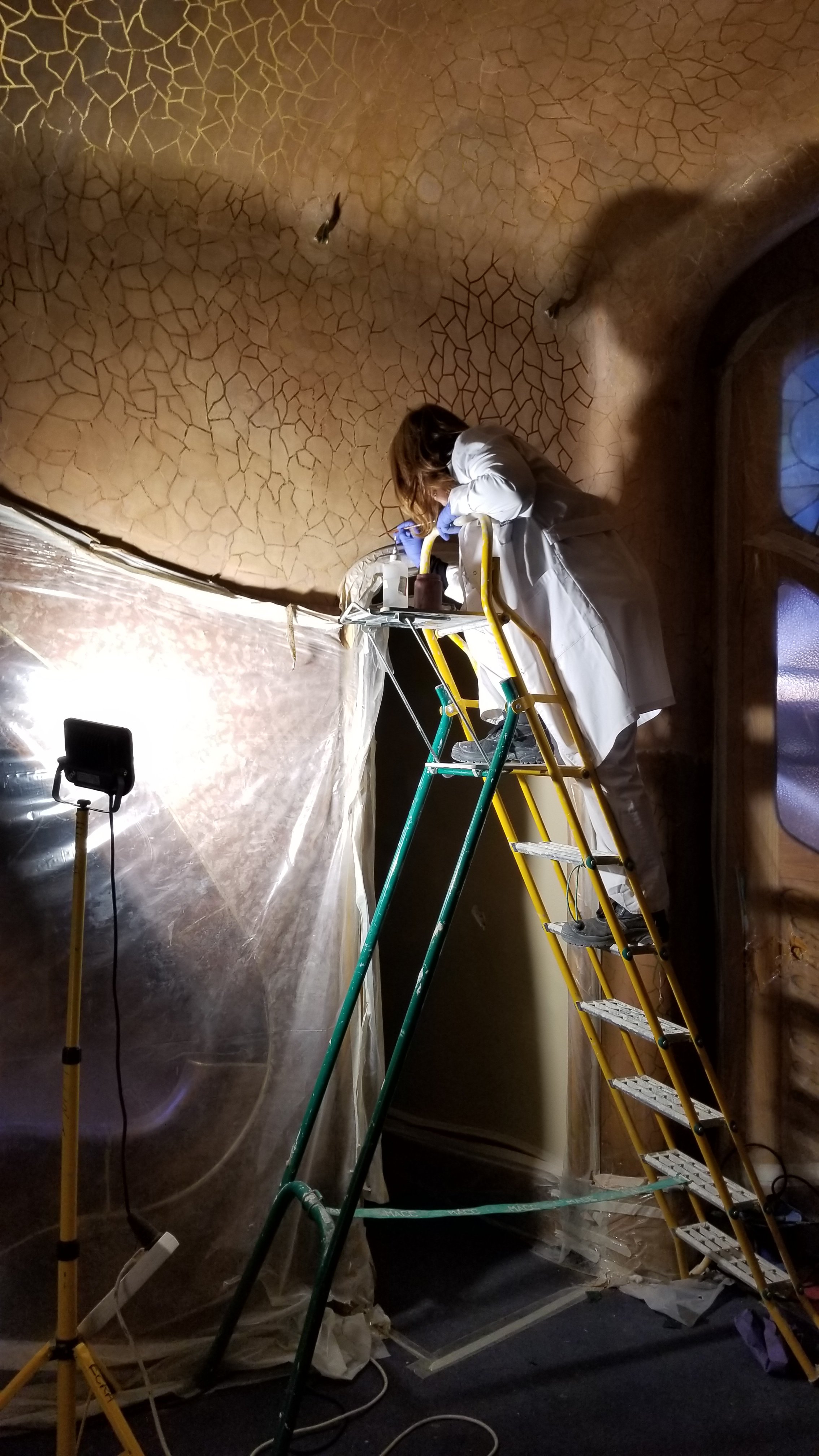
There was a large renovation project going on, right in the middle of the tour area. They have devised these virtual visual tour guides where you can hold up your audio guide and see what the room is supposed to look like when it’s completed. It also helps to identify certain features.
We watched this lady painting for a few mins. No way I could paint those fine lines like she did!
Be warned, the tour is very popular and the house is very crowded. My photos don’t show the crowds inside, but that was by design…..I don’t want a ton of photos with people performing fake poses for Facebook. My absolute favorite is where the girl looks back over her shoulder at the camera. Maybe a little lift of the leg?? Move that hair over. Oh my, you are soooo sophisticated!
Thanks….I’ve seen enough of that to last a lifetime….and then some.
Next up….La Sagrada Familia!
